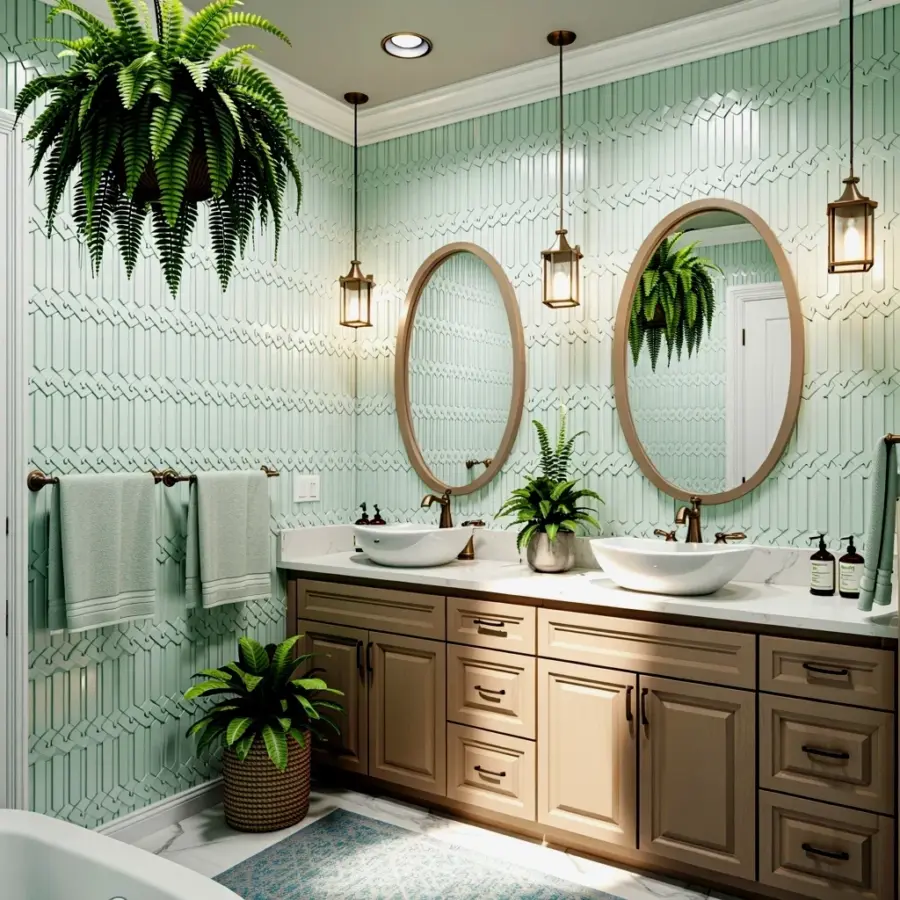
Tiny showers are a special kind of design puzzle, and honestly, the tile you choose can make or break the whole room. I have measured more awkward 32-inch alcoves than I care to count, and I have learned that the right tile tricks your eye into seeing square footage that just does not exist. The best small bathroom shower tile ideas are not about shouting for attention, they are about creating a quiet, seamless flow that makes the walls feel like they are stepping back to give you room. I have rounded up the specific styles and installation tricks that actually deliver on that promise.
You are probably standing in a bathroom showroom or scrolling through a million Pinterest pins right now, and the options feel overwhelming. Let me be the friend who walks you through the shoebox-sized shower situation with zero jargon and zero judgment. We are going to cover the big brain concepts, like why large-format slabs fool your brain, and the simple stuff, like why the color of your grout matters more than you think. By the end of this, you will know exactly which tile direction to point your contractor toward.
Vertical Subway Tile Tricks the Eye With Height
Subway tile is the default answer for a reason, but the way you lay it changes everything in a compact stall. If your ceiling is low, stack those classic 3×6 rectangles vertically instead of in the standard running bond pattern. Your eye naturally follows those long vertical lines upward, and the ceiling suddenly feels a whole lot higher than it actually is. It is a simple trick that costs nothing extra, you just ask the installer to change the orientation.
Here is the thing, you also want to pick a large-format subway tile if you can find one. Think 4×12 or even 6×18 instead of the tiny 3×6 pieces you see everywhere. Fewer grout lines means less visual clutter, and less clutter is the whole game when you are working with a space the size of a phone booth. The elongated shape draws the eye along a single clean line.
And do not stress too much about the exact shade of white, though I have opinions. A bright white grout against a soft white tile looks clean but slightly busy, while a grout that matches your tile exactly creates a smooth, almost monolithic surface that removes all visual noise. That smooth look is your best friend in a corner shower.
Large-Format Slabs Create Seamless Space
Look, the most counterintuitive tip in the small bathroom playbook is to use enormous tiles. A big 12×24 or 24×48 slab in a tiny shower feels wrong in theory, but it is magic in practice because it means you have long, uninterrupted surfaces with very few grout lines to break up your vision. When you have a massive piece of marble-look porcelain stretching from the shower floor to the ceiling, there is no busy pattern to remind your brain how cramped the area is.
Your brain wants to see the whole wall as one surface and not a patchwork of fifty million little squares. Large slabs let the wall read as a single, calm, expensive-looking plane, almost like a wet room in a high-end hotel. The fewer interruptions there are, the less aware you become of the physical boundaries of the shower.
Just keep in mind that bigger tiles are heavier and require a perfectly flat wall during installation. Your contractor might charge a bit more for the precision work and the extra muscle needed to haul those slabs around. It is an investment, but it creates the most foolproof “bigger” illusion I know.
Use a Shower Niche as a Focal Point
A shower niche is that little built-in shelf where you keep your shampoo, and it is usually just an afterthought. That is a wasted opportunity, honestly. In a tiny shower, a well-designed niche can act as a deliberate focal point that gives your eye a place to rest, completely distracting from the overall compact footprint. Think of it as jewelry for the shower; it adds depth and a moment of interest without consuming any floor space.
Instead of tiling the niche with the same small pieces as the wall, use one solid slab of contrasting stone or a mosaic strip that catches the light. I have seen people do a single vertical stripe of dark tile behind the niche to create a faux feature wall, which is a stunning trick. It draws your eye directly to that back wall and makes the whole shower feel like it has a curated design moment.
Make that niche work double duty by making it tall and elongated rather than a small square. A neat linear slot looks intentional and modern, while a big square box can look clunky and awkward in a small stall.
Light Colors and Expansive Whites Are Safe Wins
Ok so, everyone tells you to go light, and it is cliche because it works, but I am going to add a nuance to that advice. You do not need a sterile, blindingly white prison cell. You need a light color with a soft, warm undertone, like a greige or a warm alabaster which feels as bright as white but adds a whisper of spa-like calm. These tones reflect the maximum amount of light around the room without looking clinical.
Dark tile is gorgeous, I get it, but a dark tile wall will soak up all the available light and visually shrink the boundaries of the room immediately. If you love the moody look, save it for a single accent niche or a narrow vertical strip. That way you get the drama without making the space feel like a cavern (the bad kind of cavern, not the stylish kind).
For the main field of tile, stick to colors that are close to your wall paint and your bathroom fixtures. The more everything blends together, the less defined the edges of the shower become. It is a seamless look that is genuinely relaxing to be in, trust me.
Pattern and Direction
You can still have fun with pattern, but you have to be strategic when you are dealing with a shoestring budget and a small wall. Herringbone, for instance, is a wild pattern that looks gorgeous, but it creates a lot of visual movement and cuts a small wall down. If you love it, use it as a single accent strip inside the niche or on one narrow wall only.
A hexagonal tile, a little hexagon, on the floor is a fantastic way to add texture and interest down below while keeping the big wall clean. The tile on the floor can have more personality because your eyes do not rely on the floor for spatial perception. Keep the walls simple and let the floor do the talking.
Also, do not underestimate the power of directional patterns that point you toward the room’s best feature. For example, running hexagon tile in a straight line toward the doorway can elongate the floor area. It is a subtle prompt that guides your attention to where you want it to go rather than letting the eye wander to the cramped corners.
Grout Color and Layout Decisions
We touched on grout, but I want to hammer it home because grout is the skin of the room. In a small shower, the grout line pattern is the strongest visual cue you have. If you have any pattern on your tile, use a grout color that blends with the tile to create a soft, blurred effect instead of a super sharp grid. A stark white grout on a dark tile is high contrast, which makes any pattern pop, and that pop makes the wall lose room.
Here is a quick mental checklist for the tiny shower layout:
– Use a contrasting dark grout only if you want to highlight the pattern intentionally.
– Use a matching grout to hide the grid layout and maximize the space.
– Always consider a sanded grout for floors, it offers better traction underfoot.
– Never use white grout near the floor unless you love scrubbing it on your hands and knees. Spare yourself.
The layout is just as important. Avoid the full running bond offset (the classic brick pattern) on a small wall because it emphasizes horizontal lines that stop abruptly at the corners. It draws your eye side to side, physically widening the wall it is on, which can make a narrow stall feel weird. Instead, use a straight stack or a vertical running bond to pull the eye upward, making the shower feel taller and more open.
Contrast With Textures
You can play it safe with color, but do not be too safe with texture, or you will end up with a flat-looking space. Mixing finishes, like pairing rough, matte stone-looking tile with the smooth, glossy surface of glass on the same wall, adds a subtle dimensional layer. It feels premium and inherently interesting without needing a loud pattern to make a statement.
That being said, avoid overly glossy tiles in a small shower because the reflections can cast strange lights and highlight every water droplet. A matte or satin finish hides soap scum way better and absorbs light rather than bouncing it around in a chaotic way. Just think about the daily maintenance, not just the Pinterest photo.
Texture on the floor is also a non-negotiable. The shower floor should be a smaller mosaic tile that conforms to the slope and gives your feet a little grip. Big tiles on the floor will not shape to the drain properly and are honestly a slip hazard.
So there you have it, your crash course in making a tiny shower feel like a much bigger deal. The biggest takeaway is to stop thinking about tile pieces and start thinking about the overall surface and light reflection. Lean into those clean lines, and the space will do the rest.
I would love to know which one of these small bathroom shower tile ideas you are adding to your inspiration board first. Are you going for the sleek large-format slabs or the vertical subway tile trick? Drop a comment below and share your plan!
Leave a Comment